
A billboard gets roughly 3 to 5 seconds of your consumers’ attraction and within that window it either lands or disappears. Great billboard design is not just about cramming in every detail about your brand, it is rather about making one thing land instantly, memorably and without any sort of effort.
The below best practices for billboard design cover everything from typography to color and the rules that consistently separate the best performing outdoor ads from everyone else.
The Best Practices for Billboard Design
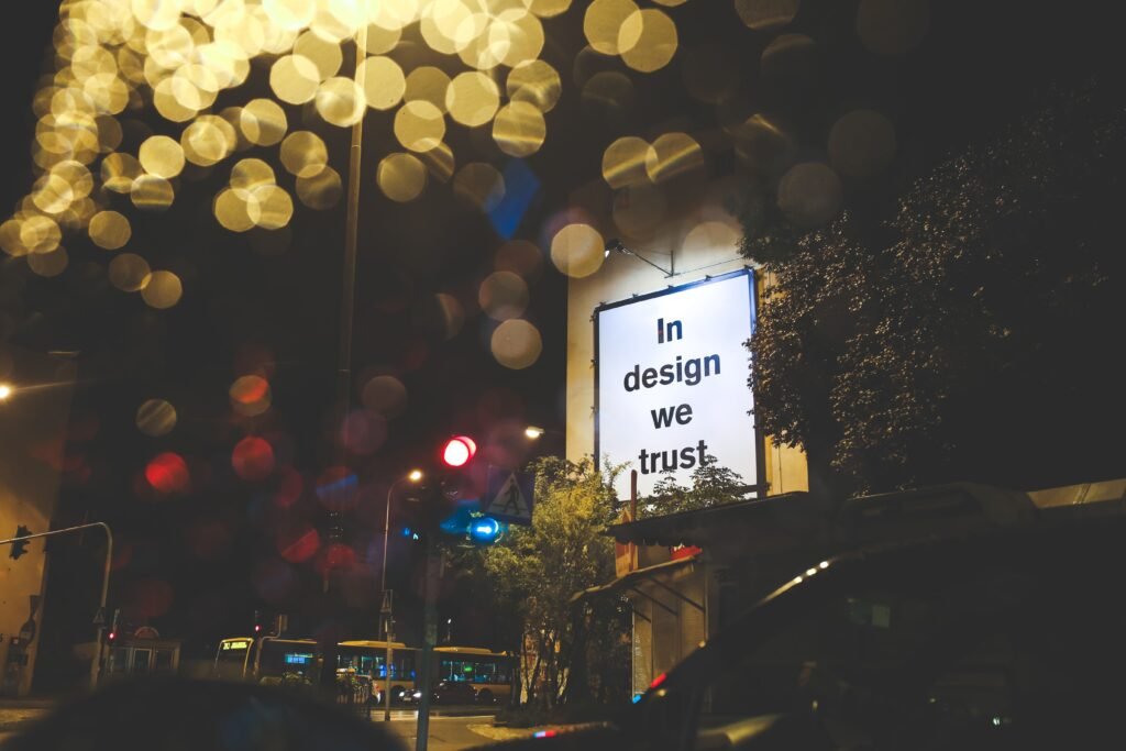
The best practices for billboard design are as follows:
- The 5-Second Rule: The Foundation of Effective Billboard Design
Every decision in billboard design should be filtered through one specific question: can someone understand this within 5 seconds or even less?
The 5 second rule is the most important thing in outdoor advertising. A driver at speed or a pedestrian walking past or even a commuter glancing up from their phone are all your audiences. They are not stopping to read your ad. They are not zooming in. You only have 3 to 5 seconds at best.
That constraint should inform every design choice. If the core message is not immediately clear at last, then the entire billboard campaign investment is undermined before it even starts.
- Seven Words or Fewer: Keep It Short
This is the single most cited rule in billboard advertising. You have to keep your content within 7 words or less. Some even say that 7 words is also too much. Others push it to words or fewer than ten in specific formats.
But why keep it short? Because a billboard ad is not a print ad or a web page or a brochure. People are moving, and your message needs to stick within seconds. The most effective billboard designs historically use five words or fewer. Like, “just do it”, “think different”. These didn’t just become famous because they were clever. They became famous because they were short enough to fit into the visual field of someone moving at 80 km per hour.
Concise messaging forces clarity into the viewer’s mind. If you can’t express your point in seven words or less, the problem usually isn’t the format, it’s your messaging.
- Font: Readability Over Everything
Next is font choice which is the most consequential decision in billboard design and it comes with one criteria: legibility at distance. Sans-Serif fonts are the most consistent recommendations when it comes to advertising design. They are clean, they’re easily visible at large scale and they do not lose definition at viewing distance.
On the other hand, script fonts are the opposite. They are nearly impossible to read at specific speeds and distances, so you should avoid those. In many cases, the advertiser prioritizes brand personality over the audience’s ability to understand the message, so make sure not to make that mistake.
Font size matters just as much as the choice of a face or model on a billboard. A rough rule of thumb is 10 feet of viewing distance for every inch tall the letter is. This means for a billboard visible from 300 feet, letters need to be at least 30 inches tall to remain legible and to ensure readability.
- High-Contrast Colors: Make the Eye Work in Your Favour
Color is a tool for attention. High contrast combinations are what will allow your billboard ad to be seen from a distance in varying light conditions and at speed.
The most readable combinations are black on yellow. This combination for outdoor advertising has proven to be attention-grabbing and is most used in effective billboard work globally.
White text on dark backgrounds like navy, blue, black or deep green can perform strongly in most conditions.
High contrast between background and foreground is the rule. Low contrast is the fastest way to make a billboard disappear against its own environment. Try to avoid any color combinations that look fine on screen but flatten at scale.
For example, light grey on white, yellow on white or pale pastels should be used where they genuinely serve readability. If your chosen colors do not do that, then do not opt for them.
- Call to Action: One, Clear, and Actionable
Every effective billboard design needs a call to action but not five or six of them. A call to action should be clear and specific. One clear instruction like visit this URL or call on this number or find us here.
The CTA needs to be short and easy to remember. Phone number usage on billboards has a very specific rule. A phone number that’s ten digits of random numbers is impossible to retain in three seconds for the viewer. If a number is used, it needs to have a vanity number or an extremely simple sequence. Otherwise, a URL, QR code or location reference could prove to be more practical.
QR codes are now becoming a valid element in digital billboard design and increasingly on static billboards as well. A QR code at billboard scale needs to be large enough to scan from a relevant distance.
- Focus on One: The Single Message Rule
Try to focus on one single message. One of the most common billboard mistakes is trying to communicate multiple things all at once, like product benefits, offers, locations, websites etc.
Each additional element dilutes your brand messaging. People remember one thing from an outdoor exposure if you are lucky. So, give them one thing worth remembering. Focus on one message, one visual, one CTA and resist the temptation to add. This is designing your billboard at its finest disciplined level.
Also Read: Billboard Advertising Design Ideas That Actually Work
Conclusion

For many, billboard advertising can prove to be an unforgiving format. There are no second chances at the viewer who drove past too fast to read the small text at the bottom of your panel. That is why it is important to opt for the best practices for billboard design.
Consider them not just as guidelines but operating conditions, so that your ad performs at its finest and you get the needed ROI. Design a billboard the way you would design a highway sign, not a magazine spread. It should be eye-catching, legible, concise, high-contrast and build around a single core message that the commuter can retain in mere seconds or less.
Remember that effective billboard design is not about being clever, rather it is about being clear, because clarity at scale and speed is the hardest creative discipline there is, but can give you the best possible results.
At Selvel One, we understand that impactful outdoor work starts with intelligent advertising design. From out-of-home strategy and billboard campaign planning to creative execution across digital billboard and large-scale format static billboard networks, we can help with all. Contact us today to know more.
Frequently Asked Questions
How many words should a billboard have?
Typically, the industry standard is 7 words or fewer. This is enough for someone to read and retain your message in 3-5 seconds.
What font is the best for billboard design?
Sans-serif fonts like Helvetica, Ariel, etc. are the most recommended for maximum legibility at distance and scale.
Should you put a phone number on a billboard?
You should put a phone number on a billboard only if it’s a vanity number or an extremely simple number to remember. Random digit sequences are impossible to retain by the viewer. You can put URL or QR codes in place of that.